Devotional Publication
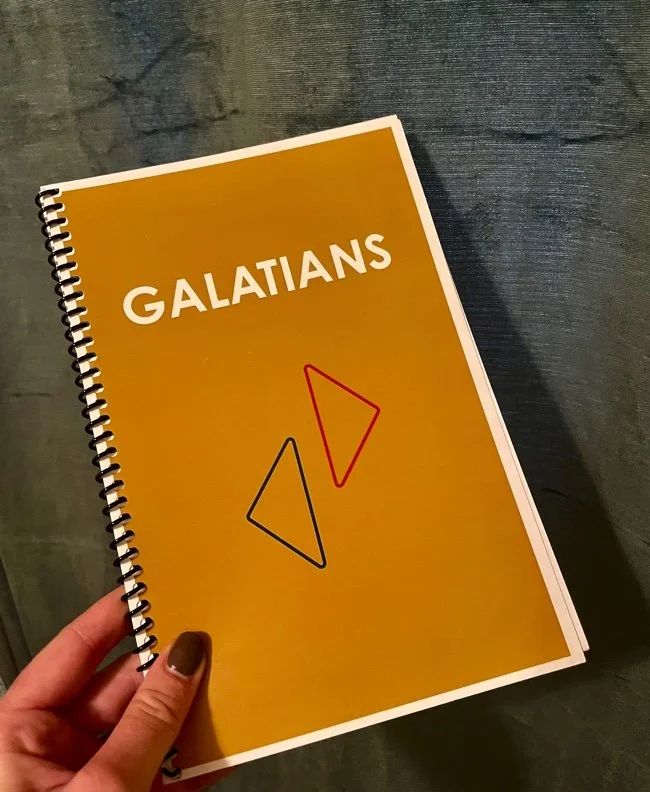
Over the past three years I had the opportunity to work with a local church to typeset, design, and print daily devotionals. I made decisions on artwork and organizational layouts for these devos while also getting to collaborate with the pasters and others writers who contributed to the content!
TYPESETTING
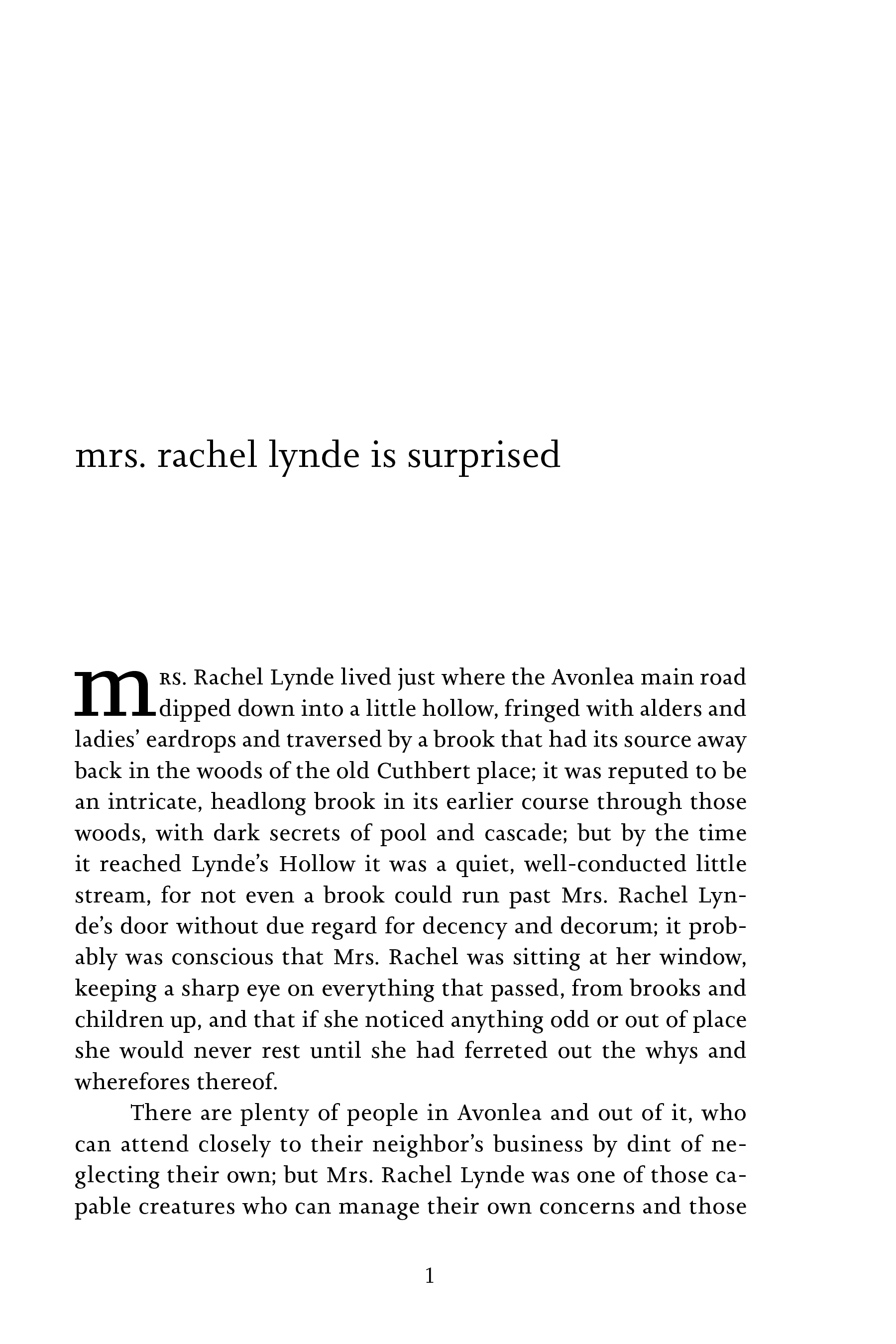
This publication is a sample of a book that I typeset and styled using all the tools in Indesign to create a pleasing spread. A cover was then illustrated for the finished publication to encapsulate the more visual aesthetic of the typeset style.
Anne
The choice to use lowercase headers was an attempt to modernize this novel for younger generations. The cover pages are minimally stylized to appeal to the younger youth and encourage interest in this timeless literature. Anne of Green Gables is a such an impactful coming-of-age that audiences far and wide can rate to. I wanted my type to be universally understood - but seemingly understated - as Anne the character is.
The illustration on this cover is taken from an iconic piece in Anne of Green Gables. Not only does the immediate imagery relate to the viewer but I also used the number of carrots to represent the new family this beloved novel is about. The illustration is representation of Marilla, Matthew, and Anne. Anne is the anomaly in both society and her new family. Like the typesetting, I wanted understated imagery that was immediate. Not only are the carrots a recall to the three family members and their home on the beloved Green Gables Farm, but also a reference to Anne’s red hair and her least favorite nickname.
Illustrated Cover: Anne the Anomaly
This is my experimental publication. The purpose of this project was to organize a large amount of content into one publication that was designed in an unique way. I chose a commencement speech given by Shonda Rhimes at Dartmouth College in 2014. She uses tough love to encourage graduating students to do and experience the world now and become shoe they are supposed to be through their experiences.
EXPERIMENTAL PUBLICATION
IMAGERY
Elements like this graphic were created for each page as supporting imagery. Within each spread, the speech is full of rich ideas and insights. The photographic and illustration graphics were made to keep interest and hone the content.


CONCLUSION
This publication’s final page is a graphic with collected elements surrounding the subjects head or mind. This final graphic was meant to represent the experiences that we collect and how they make up who were are. Shonda ends her speech with that push for the students to go and experience life and become they people they were meant to be.


